


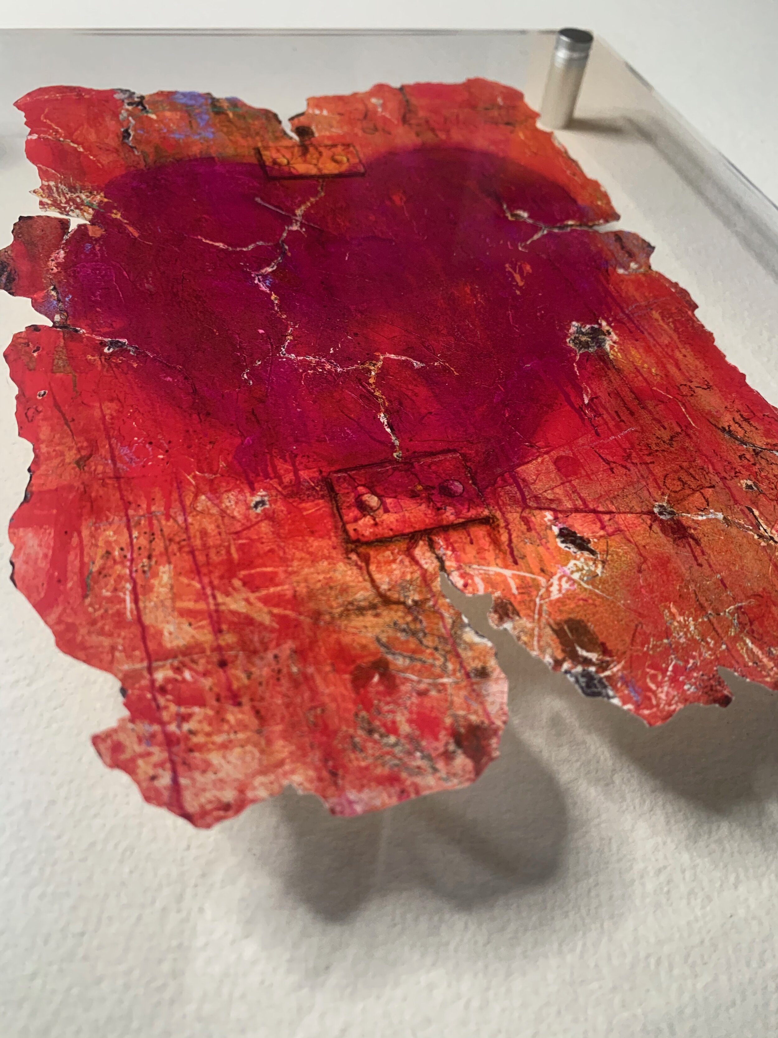


Not Perfect But It's All Yours (16"x20")
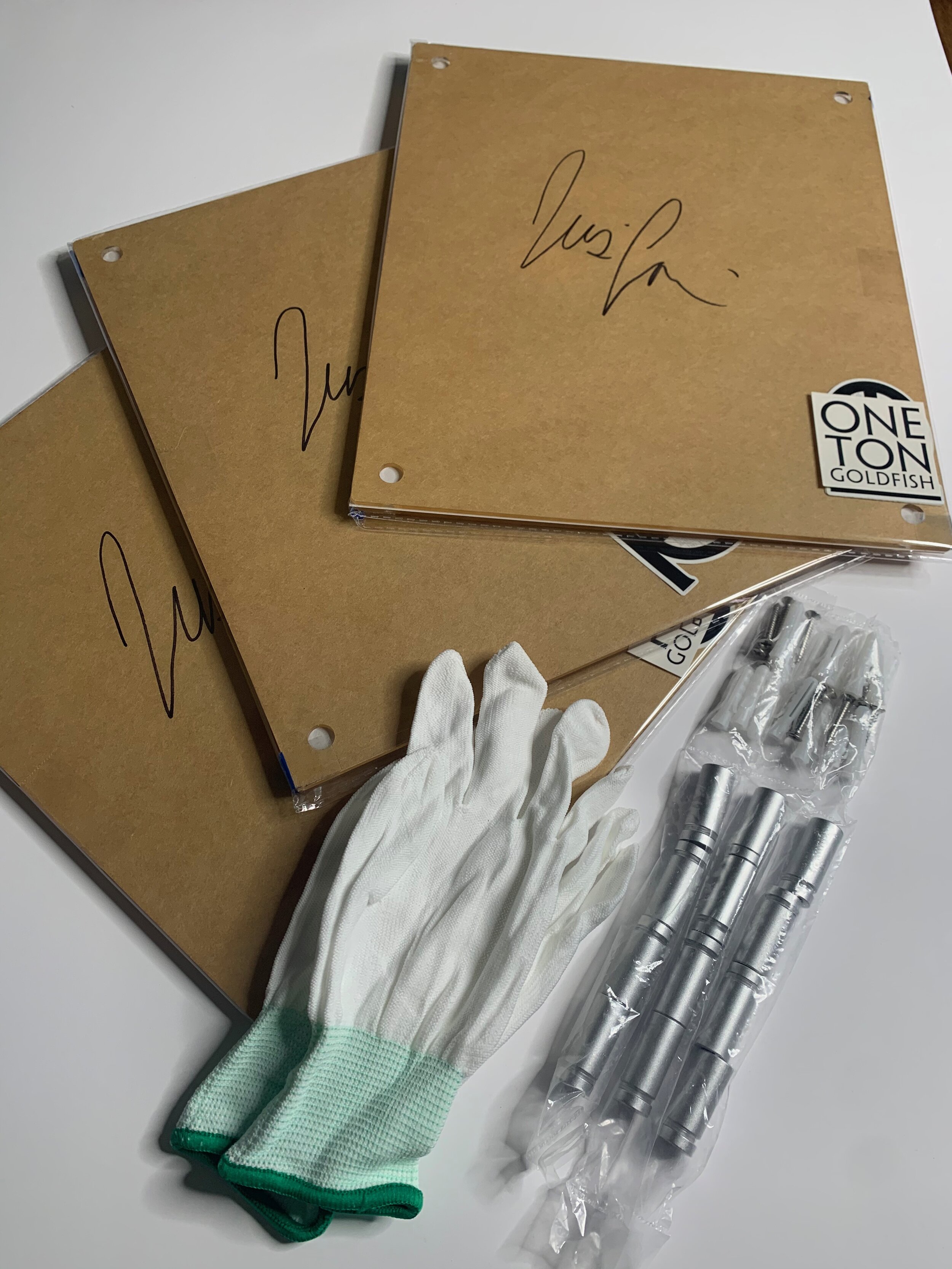
Limited Edition Archival Prints of 22 each size
SIZE
16x20inch scale on archival paper
18.5x22.5x2inch Framed
Custom hand cut by artist
Signed, dated and numbered
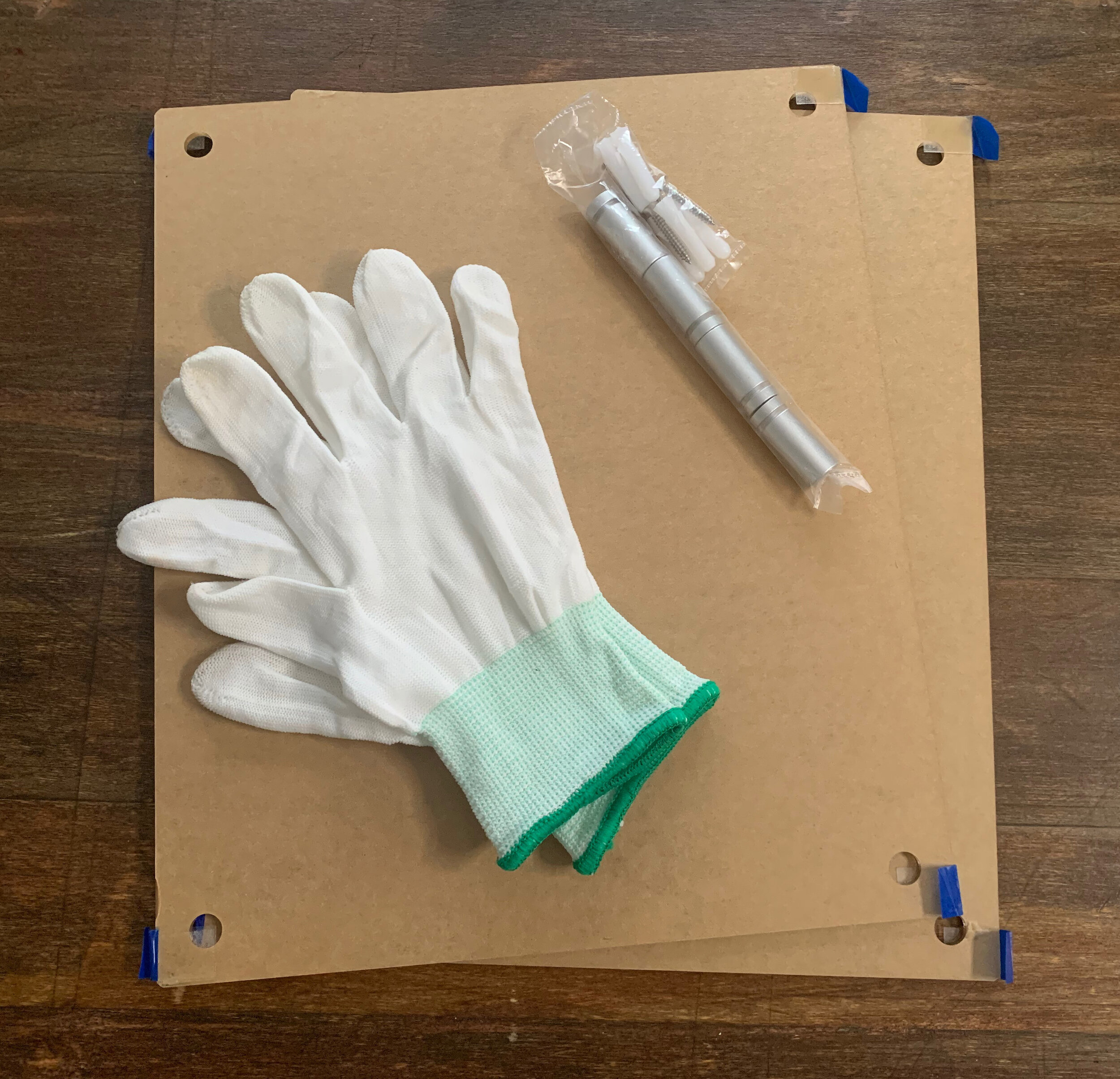
Purchase comes with Signed Print, 2 sheets plexiglass (frame), mounting hardware, white gloves, installation instructions, and 2 One Ton Goldfish stickers.
“NOT PERFECT BUT IT’S ALL YOURS”

Not Perfect But It’s All Yours
30” x 40”
Mixed Media
Original - Sold
Originally, I named this piece “Holding IT Together”, remarked by the relation of the cracking wall falling apart with bolted plates holding it together. It was to symbolize or lives and the centered heart to represent what it’s worth keeping it all together for. The first time I saw bolted plates holding walls together was in Venice, Italy. A city known as...” The city of love”. A romantic and old-world city and yet behind it all, time taking its toll. The city is sinking, and the walls are bolted and pinned from the inside to hold the structures together. We see beauty from the outside world looking in, but rarely do we see inside the walls, the internal struggles and damages within. Does this make it less beautiful and magical, or more so? To know a thing that is mortal, that is not perfect, but is willing to be present and stand before all with open arms. To do what it takes to keeping it together for the sake of love?
So, I changed the name, I saw that it wasn’t just about acknowledging the effort to “Holding IT Together” but accepting these walls and hearts of ours as not perfect. It’s a place that has seen, felt and been through a lot. It’s a seasoned yet imperfect love that shows up, holds grace in a state of vulnerability…and is all yours.
Deeper into Color connection –
For the heart, it wasn’t enough to use a blatant red with a fresh feel of lust and passion, I chose my favorite purple, Dioxide purple, it was the first color I used for the Reflection series. The vibration of it is intoxicating, but among that purple lies a multitude of brilliant variation. Purple madder with its deep rounded reddish like burgundy wine, a mature cherry blossom pink, velvety violet, and imperial purple to name a few. Bountiful amounts of emotional experiences aged from the youthful to the royal, and stained with a rustic burnt sienna, inducing a seasoned heart, rich of wisdom and time. The background, I picked one of my favorite colors, A blend of layers centered around Tangerine Tango. I first laid eyes on this color when it was announced as Pantone color of the year in 2012, described as dramatic and seductive, a spirited reddish orange yet a calm warming energy. I felt pure orange was too naive and purely fun energy, and a red would be to lustful, seductive and purely physical. I wanted the background to spell out a warming love full of robust energy to last the duration of physical attraction. Something more than just passion but full of life no matter the chipping and aging that accrues over time.